Introduction
In today’s data-driven world, the ability to effectively analyze and visualize data is crucial for making informed business decisions. Power BI, a powerful business intelligence tool developed by Microsoft, empowers users to transform raw data into compelling visualizations and interactive reports. In this comprehensive blog post, we will delve into cutting-edge techniques for data visualization using Power BI development. From advanced visualizations to interactive dashboards, we will explore how to harness the full potential of Power BI to unlock valuable insights and drive organizational success.
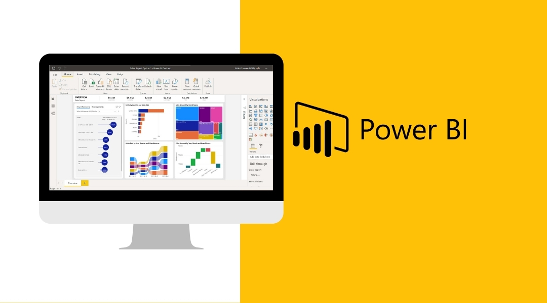
I. Understanding Power BI: Unleashing the Power of Data Visualization
Power BI is a robust business intelligence tool that enables organizations to transform data into interactive visualizations and reports. It combines various components such as Power Query, Power Pivot, and Power View to provide a comprehensive platform for data analysis and visualization. Power BI allows users to connect to multiple data sources, cleanse and transform data, and create visually appealing reports.
II. Data Preparation and Transformation Techniques in Power BI
To ensure accurate and meaningful visualizations, data preparation and transformation are crucial steps in the Power BI development process. Power Query, a data connectivity and transformation tool, allows users to import data from various sources, perform data cleansing operations, and shape the data according to their requirements. With Power Query, you can merge data from different sources, split columns, and pivot data to create a unified dataset.
In addition, Power BI supports the use of calculated columns and measures. Calculated columns allow users to create new columns based on existing data, while measures enable the creation of dynamic calculations using the DAX (Data Analysis Expressions) language. By leveraging these techniques, users can enrich their data and derive valuable insights during the visualization process.
III. Essential Visualizations in Power BI
A. Basic Visualizations
- Bar Charts, Column Charts, And Line Charts – Bar charts are effective for comparing data across categories, while column charts display data as vertical bars. Line charts are ideal for showing trends over time.
- Pie Charts & Donut Charts – Pie charts represent data as proportional slices of a circle, while donut charts add an empty center, allowing for additional information or labels.
- Scatter Plots & Bubble Charts – Scatter plots display the relationship between two variables, while bubble charts add a third dimension by representing data points as bubbles with varying sizes.
- Tree Maps & Funnel Charts – Tree maps visualize hierarchical data using nested rectangles, while funnel charts show the progressive reduction of data at each stage of a process.
B. Advanced Visualizations
- Waterfall Charts – Waterfall charts are useful for illustrating the cumulative impact of positive and negative values, showcasing the flow of data across a series of categories.
- Gauges And KPIs (Key Performance Indicators) – Gauges provide a visual representation of a single value within a predefined range, while KPIs offer a concise overview of performance against specific targets or goals.
- Heat Maps & Geographic Maps – Heat maps use color intensity to represent the density or value distribution of data. Geographic maps visualize data based on geographical locations, allowing for spatial analysis.
- Box Plots & Histograms – Box plots provide a visual summary of the distribution of data, including median, quartiles, and outliers. Histograms display the distribution of a dataset through bars representing the frequency of values within specific ranges.
IV. Interactive Dashboards with Power BI
Interactive dashboards enable users to explore and interact with data visually. Power BI offers a range of features to create dynamic and engaging dashboards:
- Designing Visually Appealing & Intuitive Dashboards – Effective dashboard design involves selecting appropriate visuals, arranging them logically, and using consistent color schemes and fonts.
- Creating Slicers, Filters, & Drill-Through Actions – Slicers allow users to filter data dynamically, while filters enable more granular control over data visibility. Drill-through actions provide the ability to navigate from a summary view to detailed information.
- Adding Interactivity with Bookmarks & Report Navigation – Bookmarks capture the current state of a report, allowing users to create interactive narratives. Report navigation buttons provide a seamless user experience by linking multiple pages or sections within a report.
- Utilizing Custom Visuals & Extensions for Enhanced Dashboard Capabilities – Power BI supports a wide range of custom visuals and extensions developed by the community, offering additional visualization options and functionality.
Read also -> Mobile App Development Forecast: Trends and Technologies
V. Power BI Best Practices for Data Visualization
To maximize the impact of data visualization, it is important to adhere to best practices:
- Design Principles for Effective Data Visualization – Consider aspects such as clarity, simplicity, and alignment with user requirements. Use appropriate chart types, avoid clutter, and highlight key insights.
- Choosing The Right Visualizations for Different Types of Data – Select visualizations that effectively represent the data and convey the intended message. Understand the strengths and limitations of each visualization type.
- Enhancing Accessibility & User Experience – Ensure that visualizations are accessible to all users, including those with disabilities. Use color schemes that cater to color-blind individuals and provide alternative text for visuals.
- Optimizing Performance for Large Datasets – When working with large datasets, apply data summarization techniques, filters, and query folding to enhance performance and minimize load times.
VI. Integrating Power BI Visualizations into Applications
Power BI provides options to embed reports and dashboards into external applications:
- Embedding Power BI Reports & Dashboards Into Web Applications – Integrate Power BI visuals seamlessly within web applications, allowing users to interact with data without leaving the application environment.
- Creating Real-Time Dashboards with Streaming Data – Utilize Power BI’s streaming data capabilities to create real-time dashboards that display up-to-the-minute data insights.
- Sharing Power BI Reports & Dashboards with Stakeholders – Collaborate with stakeholders by sharing Power BI reports and dashboards, granting them controlled access to the visualizations and insights.
Conclusion
Data visualization with Power BI development offers organizations a powerful tool for transforming raw data into meaningful insights. By mastering the cutting-edge techniques explored in this blog post, users can unleash the full potential of Power BI to create compelling visualizations, and interactive dashboards, and deliver valuable insights for informed decision-making. With continuous exploration and application of best practices, you can harness the power of data visualization with a Power BI developer to drive organizational success in today’s data-driven landscape.